Transparent Backgrounds are Beautiful!

I had intended to have a transparent background on the current painting I am working on, but I got it too dark, and once that happens with a transparent background the only option to lighten it is to paint over it with opaque paint. Below you can see the painting with the transparent background and the beginning stages of the opaque background I painted over it.

painting with transparent background

painting with transparent background

I had painted the transparency around the sides of my gallery wrap canvas. I’m leaving the sides transparent because I like how it looks. You can see if values were divided, with black being 0, and white being 10, this would be about a value 3. I ha…

I had painted the transparency around the sides of my gallery wrap canvas. I’m leaving the sides transparent because I like how it looks. You can see if values were divided, with black being 0, and white being 10, this would be about a value 3. I had intended the background to be a sky and a value 3 was too dark for the sky to look luminous, at least not for me for this painting.

Here is how the painting looks now, with the beginning stages of the opaque background. I am going to blend the background into a mostly smooth gradation.

Here is how the painting looks now, with the beginning stages of the opaque background. I am going to blend the background into a mostly smooth gradation.

You can see that the light side is now about a value 7.

You can see that the light side is now about a value 7.

The dark side is about a value 5 but it’s hard to tell in this picture because the value strip is catching a bit more light.

The dark side is about a value 5 but it’s hard to tell in this picture because the value strip is catching a bit more light.

Here’s the opaque paint I mixed for this. I will mix some in between values to paint the gradation.

Here’s the opaque paint I mixed for this. I will mix some in between values to paint the gradation.

This experience of getting my background too dark made me think of a blog entry I had been intending to write about the use of transparent layers of paint. Using transparent paint for backgrounds, or more accurately, for the “underpainting”, or the first layer of paint, is a longstanding tradition in painting, particularly before the impressionists. The impressionists started a new style of using thick paint over the entire surface, often in just one thick layer. But before the impressionists, oil painters tended to paint in thin layers, building up the layers slowly, and, as I wrote, leaving some of the first transparent layers showing. I generally work in this old, pre-impressionist technique. 

You can see this use of transparent painting very well in Rembrandt paintings. His shadows are usually transparent brown. Then the lights are painted with opaque paint. Having the white canvas shine through the transparent paint creates a very beautiful, luminous,  stain glass- like effect, and this beauty, I assume, is why it became a traditional technique. And it saved paint, probably important back in the days when pigments were expensive and artists had to prepare and make their own paint.

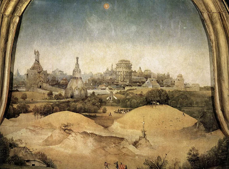
Two other painters who used beautiful under paintings were Pieter Bruegel and Hieronymus Bosch. In this detail of a Hieronymus Bosch painting below, the first layer of paint was the the lower whitish sky, which is a transparent layer. This probably covered the whole surface. Then he gradated the blue in at the top, also with transparent paint. He then painted the buildings on the horizon with a paint color from the sky. Then at some point he added another mostly transparent layer to create the color of the yellow hills in the foreground. Continuing to work mostly transparently, he now built up all the details. At the end he used opaque paint for the final details, such as the blades of the windmill and the leaves of the trees. Since these details are light over dark, only opaque paint would work. Except for these few opaque details, the whole painting is almost like a watercolor painting done with oils, in the sense that the whole painting mostly transparent paint. 

Hieronymus Bosch. the first layer of paint was the white sky, which is almost a value 10, that is, almost pure white. For realism skies need to be very light. The transparency with the white surface shining through makes the sky luminous and glowing…

Hieronymus Bosch. the first layer of paint was the white sky, which is almost a value 10, that is, almost pure white. For realism skies need to be very light. The transparency with the white surface shining through makes the sky luminous and glowing. A mistake amateur painters often make is painting their skies too dark. The old masters knew better!

Pieter Bruegel's painting The Harvesters, painted 50 years or so later in 1565, is built up using the exact same technique.

Pieter Bruegel's painting The Harvesters, painted 50 years or so later in 1565, is built up using the exact same technique.

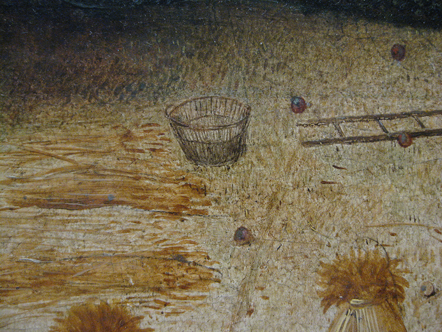
Pieter Bruegel's painting The Harvesters, detail. This photo I took myself at the Metropolitan Museum in New York, where this painting resides. I was very interested to see close up how he applied the paint. You can see how transparent the paint is …

Pieter Bruegel's painting The Harvesters, detail. This photo I took myself at the Metropolitan Museum in New York, where this painting resides. I was very interested to see close up how he applied the paint. You can see how transparent the paint is and how he used brush strokes with thin paint to add texture to the ground. The wheat is painted very thinly too. From a distance it creates a very convincing realistic effect.

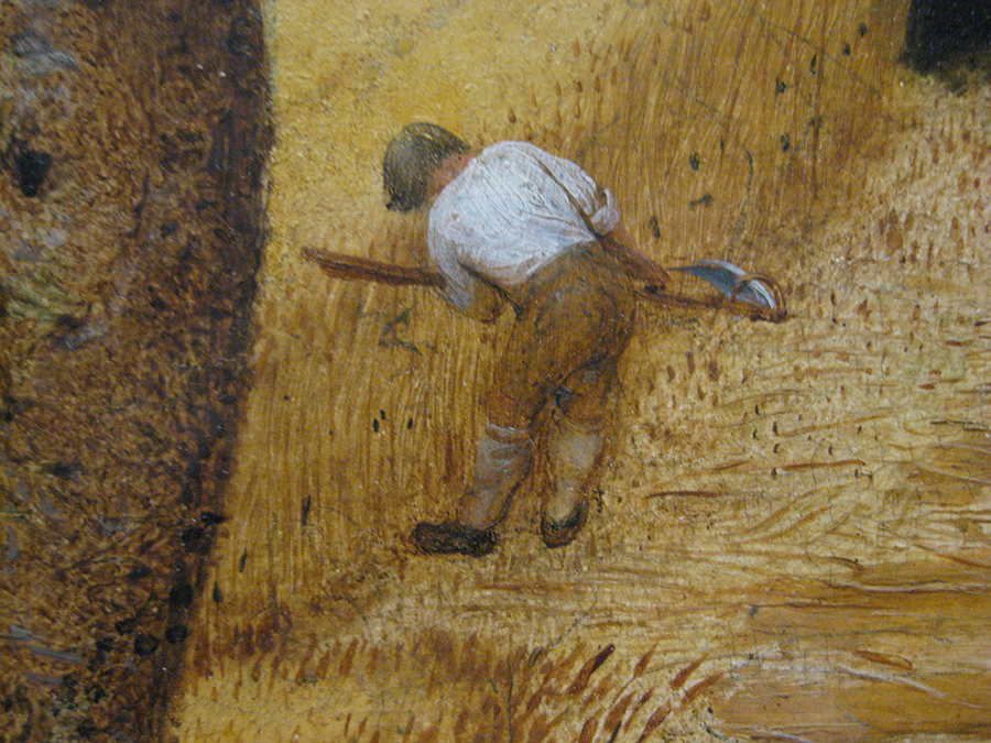
Pieter Bruegel's painting The Harvesters, detail. In this detail above the only really opaque paint is the white shirt and some black textural brush strokes.

Pieter Bruegel's painting The Harvesters, detail. In this detail above the only really opaque paint is the white shirt and some black textural brush strokes.

In these paintings they had to be very careful not to get the transparency too dark, like I did on my Unicorn painting. Even if they had had enough money for pigment to cover the whole surface with opaque paint, it wouldn’t have been nearly as beautiful.

In this painting contemporary German artist Michael Sowa uses traditional pre impressionist technique including transparent underpainting. The brown transparent background was painted 1st and is the same underpainting as seen in the soup. This adds …

In this painting contemporary German artist Michael Sowa uses traditional pre impressionist technique including transparent underpainting. The brown transparent background was painted 1st and is the same underpainting as seen in the soup. This adds unity to the painting and makes it more beautiful, and in this case works nicely to create the effect of a wet reflective surface, since the soup is reflecting the background wall.

This portrait is also by Michael Sowa. The technique is very Rembrandt like. The green transparent background was painted first. you can see it showing through the dress on the shadow side.

This portrait is also by Michael Sowa. The technique is very Rembrandt like. The green transparent background was painted first. you can see it showing through the dress on the shadow side.

I hope now that you’ve read this, when you look at paintings in a museum or art gallery, you will begin to notice where painters have left transparent backgrounds showing through and see the beauty it adds to the painting.

It's a Wrap!

I have been framing my paintings gallery wrap style, or not framing them that is, since gallery wrapped paintings don't actually have a frames, but rather just use a wide edge of the side of the painting instead of a frame. As my style is becoming simpler, I am liking the contemporary look of gallery wraps for my paintings more.

The name gallery wrap comes from paintings on canvas that is wrapped around especially wide, 1 and a half to two inch, stretcher bars. Technically, my paintings are on panels mounted on a wood frame  not wrapped canvas, but this type of framing is still usually called gallery wrap. I have been geeking out on craft a bit and have been sanding the edges and corners to slightly round them because I like the look and feel of it, and adding superglue to the corners to make them stronger in case they are bumped or dropped. I have also been sanding the sides with super fine sandpaper to give them a nice smooth feel. I varnish them when finished with a small amount of satin varnish mixed into the gloss varnish to take off a bit of the glare.

Originally when I started painting these I was painting the sides gray or some neutral color so they wouldn't compete with the image. But now I'm thinking of them kind of like sculptures, so that the sides are part of the painting, and i'm painting them with colors from the painting. I like this sculptural quality and enjoy working with my hands on them. 

Sometimes I am continuing the image from the painting around the side, and sometimes not, depending on how I think it looks as a whole.

Sometimes I am continuing the image from the painting around the side, and sometimes not, depending on how I think it looks as a whole.

Unification

Unification is the word I've been using in my art journal for the past several years to describe my process of making my painting style more consistent.  I have been painting in more or less 2 different styles; one simple and stylized like this:

The friendly Dragon, Acrylic on Panel, 11 x 14 inches

The friendly Dragon, Acrylic on Panel, 11 x 14 inches

..and one more realistic, like this:

Cat and Mouse, Acrylic on Panel, 25 x 45 inches

Cat and Mouse, Acrylic on Panel, 25 x 45 inches

I am working toward creating all of my paintings in one style instead, and that style will be more or less in between these two styles. To “unify” my style in other words. Hence the word unification. 

When I tell people about this they often say "why? Your art is fine just the way it is”. The reason has to do with 2 things. The first is for business. Art galleries want their artists to work in one style. It’s harder for them to explain an artist to collectors and therefore sell an artist’s work if the artist has more than one style. And gallery owners usually consider it unprofessional for an artist to have more than one style, which I agree with to some degree. And the gallery’s collectors get confused too. “Wait, you mean this artist did this, and that? Which do they do?” For various reasons it is less important in arts festivals, but even for art festivals it’s preferable for artist’s to present one style. 

But the second thing is much more important than business. It is for purely artistic reasons. When an artist chooses to work in one style, they are much more able to put the essence their personality, and who they are, into their art. This is because this self imposed constraint forces them decide on the approach that they have the most affinity for - their favorite form in other words, and this form is an important part of their personal voice. And this, practiced over the course of years, produces very personal and, if the artist is interested in beauty, very beautiful art. Some great examples of this for me are: Georgia O’keeffe, Rembrandt, Van Gogh, Andrew Wyeth, Robert Crumb, Goya, and Henri Rousseau. All of these artists chose one direction, stuck to it, and followed that thread of development, which led to the unique and very personal style of art that they are known for today. These artists, as well as many others whose names are not so well known but who work in this way, are an inspiration for me in this process, and I notice that all the artists whose work I love have approached their work this way.

Some artist’s don’t like to limit themselves in this way. I’ve talked to fellow artists who really like to work in many styles and find it stimulates their creativity.  I’d be curious to hear opinions from other artists about this topic in the comments below.

I have done four paintings since committing to this adventure of unifying my painting style, starting about 2 months ago. They are the top four paintings on my paintings page on my website. I am working on quicker paintings, partly for the purpose of keeping track of this process.  The paintings done before these four paintings are organized by theme. For the next year I am going post my paintings chronologically and not by theme so you will be able to see how this unifying thing is going for me. I’m also posting them this way so I can look and see how the process is going for me. As my paintings sell and are no longer hanging around my apartment, the best place for me to see them all together and to see the whole process is on my website. I’m noticing already in my last four paintings that I am leaning a bit toward more stylized with some and  toward more realistic with others. I expect to go back and forth and gradually narrow and settle towards a comfortable middle ground. I know for sure that I am going to stylize my human figures more. I expect my figures to be deliberately imperfect. I’m not going to shoot photo reference for them any more. While I am narrowing my style, I hope to keep my subject matter diverse. It might be better from a business point of view to narrow my subject matter as well as my style - galleries probably do tend to like that better - but I want to resist this and try to have my painting unified by style more than content.  I think a uniform style is a sign of maturity in an artist, but I don’t think the same necessarily holds true for content. Some of my paintings are funny, some are funny and serious at the same time, and some are serious, dealing with spirituality for example, without any irony or humor in them at all. Likewise, sometimes I am funny and sometimes I am serious. Ideally I would like to my art to represent my whole person. 

I’m excited about this unification process. I may write more about it here in my blog, and at a minimum you will be able to see it in my new paintings as I post them. Thanks for reading and following my art!

6 foot by 8 foot painting in under 3 minutes!

A collector recently bought my painting Cow Car, which was 9 inches by 12 inches. He then commissioned me to paint a larger version of it. Much larger -  6 feet by 8 feet! That is the largest painting I have ever done (except for a mural I did long ago with house paint). I had been interested in doing a large version of one of my "Animalia" paintings as I call them; paintings with walking talking animals; to see what they would look like large, so I enjoyed the project. For fun I created a time lapse video of most of the 123 hour painting process, condensing it into just under 3 minutes. Here it is below. Click on the play button in front of the cow's nose: